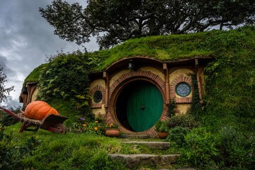
As of late, there’s been a trend in architecture to make buildings minimalist, modernized and efficient. While I believe this can do a lot as far as energy conservation as well as accessibility, a lot of these buildings take away the beauty and mystery that architecture can provide.
I’ve noticed a good portion of the modern buildings on campus don’t have the same flair as the older buildings. A good example of this would be the Language and Literature building, and its replacement, the North Education Complex.
Constructed in the late 1960s, the Language and Literature building is an iconic part of the CWU campus. The longstanding building, often referred to as L&L, was home to the English department, the philosophy department and the foreign language departments.
However, approximately a year ago it was announced that the L&L building and Farrell Hall would be demolished, and in their place will be a new building; the North Education Complex.
I do concede the points that L&L was old, inefficient, inaccessible and leaky. I don’t think L&L was perfect, and I agree that it needed more repairs than it was worth.
That being said, I’ve been an Ellensburg local for the greater portion of my life. When I was little, the CWU campus seemed huge and intimidating. However, I could easily recognize L&L due to its unique and artistic architecture.
With my wild imagination, the outside appearance of the building looked whimsical. A fantasy castle guarded by a fearsome dragon. This fantastical view of the building continued as I got older.
When I was a nervous Running Start student, the building was a quiet escape from the rest of the bustling campus.
As I declared my major, and officially joined the English department, the building felt more like home. That’s where all my classes were, where my professors were, where their offices were. It felt familiar.
I suppose my primary concerns here are with the streamlined, cookie cutter design of the North Education Complex.
On CWU’s website there’s an image of what the new building is supposed to look like. Don’t get me wrong, it looks like a perfectly fine building. It’s minimalist, and looks a lot like the other buildings on campus. But, that’s exactly what I don’t like about it.
L&L was distinctive, it was different from the other buildings on campus. I prefer buildings that tell stories when you look at them. It saddens me to lose such an intriguing piece of this campus, but why put something so boring in its place?
I’m not saying this new building should be as complicated and confusing as the L&L building was. What I am saying is I think the architecture of the North Education Complex doesn’t hold a candle to that of the L&L building.
I believe there’s a way for us to create buildings that both maintain the more thought-provoking, artistic aspects of architecture, while simultaneously being energy efficient, accessible and easy to understand.
I don’t think we should have to compromise artistic architecture for the sake of buildings seeming modern.


